Responsive Website Design:
Farm + Sea
I took on the e-commerce website’s redesign, to increase lead generation and improve the conversion rate by 15%.
The approach involved an audit of business and user goals which led to a new information architecture, page inventory, and product card designed for seamless add-to-cart actions. The increased browsablity and virtual ambiance that captures the essence of Farm + Sea drives conversions.
Project Details
Roles:
UX research, UI/UX Design
Timeline:
1 month
Shopify analytics, Figma, Adobe Photoshop, Lyssna user testing platform
Tools:
Redesign Highlights:
Browse
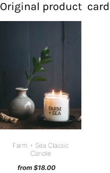
Before
“All Candles” page hosted collections, not all products
There was no add-to-cart button in the browsing experience for a quick action
Limited visual symbols to help evoke users’ associations with scents
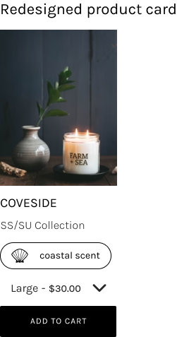
After
“All Candles” page now contains all candle scents available.
Product cards include an add-to-cart button for task completion without leaving the browsing experience
Product Cards now have a hand drawn icon to categorize the scent
Redesign Highlights:
Product Page
Before
The browse ux for candle scents was limited to a dropdown menu in the product page
Text size was too small, causing an inaccessible experience for users
The product page was an end point for a user’s browsing experience
After
Users browse on the All Candles page and remain in a focused flow on the product page
Text size increased to align with accessibility standards
Related products section added to the bottom of the page to support browsability
The Process
1.
Empathize
Background
Farm + Sea is a candle and body product brand that uses the power of scent to evoke a memory, create a mood and uplift or relax. Farm + Sea retails directly to consumers nation-wide through their website. At present, the conversion rate of visitors to purchases made is 6.97%. The goal of the website redesign is to increase the conversion rate by 15%. This increase in the conversion rate coincides with users’ goals to discover all products and scents available to plan their purchases. The current website is accessed by users primarily via mobile (60.45%), and secondarily by desktop (39.55%).
Research Objectives
Identify users’ primary goal for visiting the Farm + Sea website and their behavioral patterns while navigating the website.
Understand the features of the current website that cause pain points in a users ability to easily browse items available.
Discern elements that can be redesigned to strengthen the add-to-cart to checkout task flow. Ideally the percentage of users completing the task flow would grow from 6.97% to 22%.
User Interviews
5 participants were interviewed. Each interview took place for approximately 35 minutes.
Every participant is a frequent customer with Farm + Sea, either online or at the brick and mortar store
Two participants were frequent online shoppers at the Farm + Sea website and three participants had never visited the Farm + Sea website
Key Insights
All interview participants commented on the branding on the website feels succinct with their in-person experiences.
Users felt the “All Candles” page should display all products available, instead of the three cards indicating different collections
Dropdown ui for scent selection was not conducive to a delightful browsing experience
Affinity Mapping
Users primarily goal while visiting the Farm + Sea website is to research product inventory, new scents, and new products released
Key Insight no.1
“All products” pages display collections instead of all products and scents available at a glance. This was counter to what users expected, causing users to abandon the search for specific products through their preferred method of browsing and utilize the search icon instead
Key Insight no.2
User Persona
Lindsey represents the type of user who frequents the Farm + Sea website to browse. She needs to locate items quickly and add them to cart with ease.
2.
Define
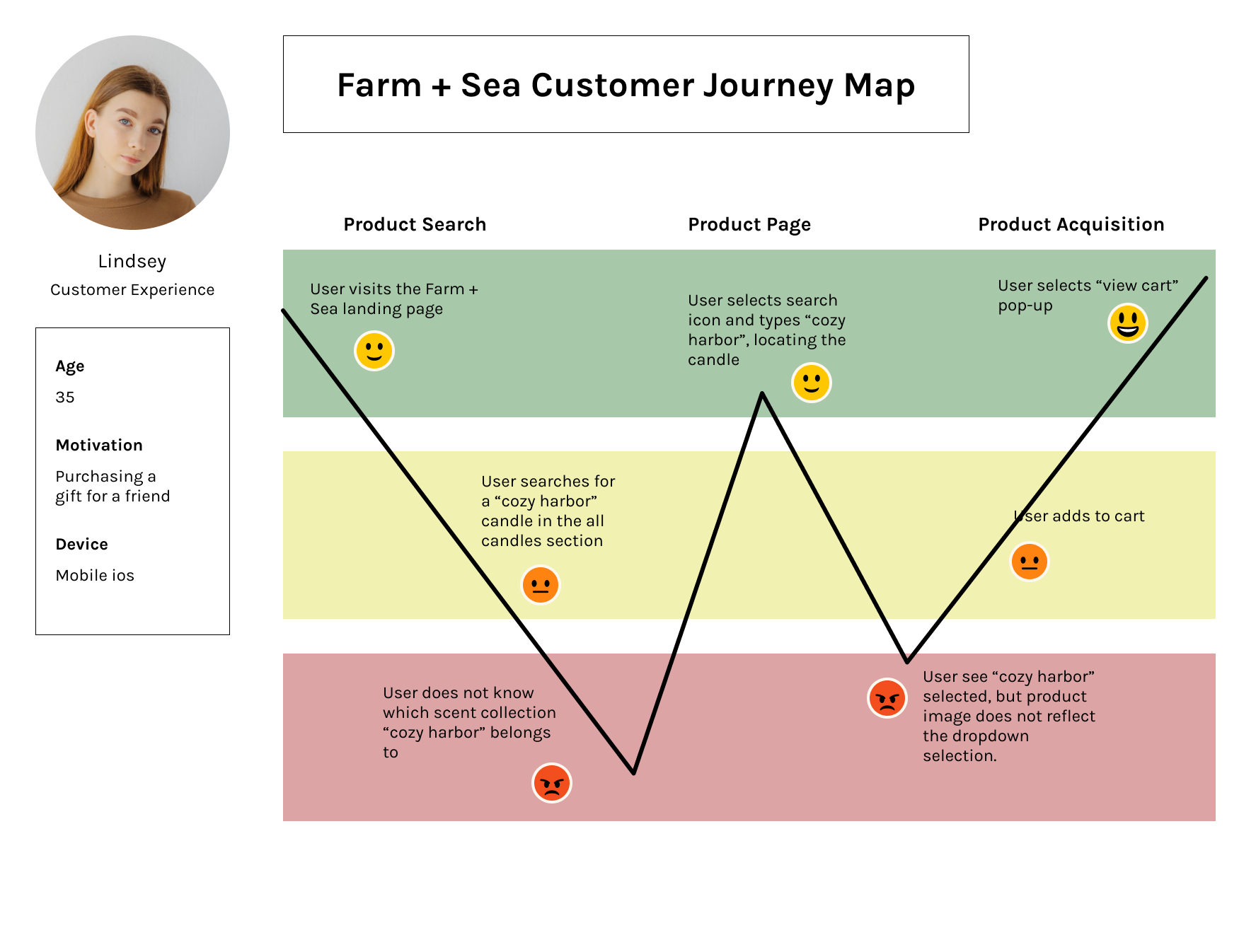
User Journey Map
I created a User Journey map as a tool to bridge the ux research/persona development with a user flow. The milestones in the user journey are derived from data gathered in the user interviews, which included a moderated walk through of the Farm + Sea website.
Sitemap
The sitemap captures Farm + Sea in its entirety. The blue path illustrates our area of focus for this case study. The improvements for browsing and quick add-to-cart actions will be reflected across the whole site. The sitemap was designed for consistency in information architecture across all product groups.
3.
Ideate
The Problem Statement
The intent of this project is to create a digital experience with virtual ambiance that is reflective of Farm + Sea’s brand values and essence. As a company specializing in a large variety of fragranced products, users experience challenges in browsing the large quantity of inventory. The website’s current ui limits users’ browsing to a dropdown menu within the product page. Based on initial research and an analysis of competitor’s websites, this dropdown ui may influence users to experience analysis paralysis. The ui and information architecture must support users in accessing the total inventory while maintaining mobile device compatibility, in consideration of the 60.45% of users accessing the content via mobile.
User Flow
The user research determined that users are commonly logging on to the Farm + Sea website to browse items, view information about products, and add an item to cart. This was illustrated in the User Journey deliverable, and all paths were explored in the User Flow.
The Browse to Cart Flow:
Low to Mid Fidelity Wireframes
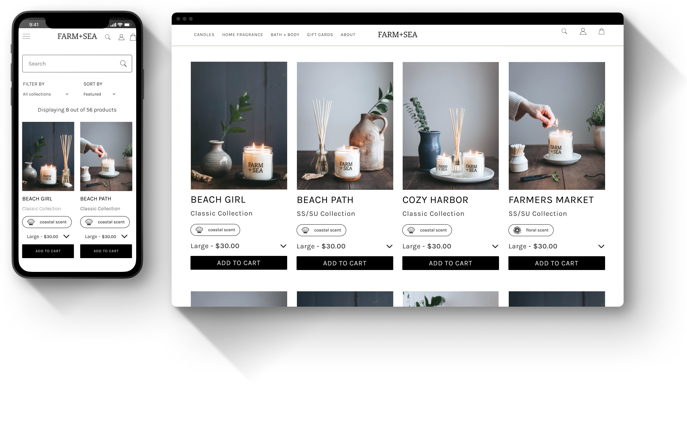
In the redesign, the primary objective was to enhance the user experience by integrating more comprehensive product information directly into each product card. Specifically, I created a product card for each fragrance. This is an improvement from the previous design, which provided users with only two collection cards: classic scents and seasonal scents. The development of individual product cards restructured the information architecture by displaying all products onto the “All Candles” page. Previously, individual product scents were only available to browse via a drop down on the seasonal or classic Candle Product Page. The revised product card design, and subsequent information architecture, allows users to access detailed insights at a glance, thereby improving their browsing efficiency.
We also introduced an 'Add to Cart' button on each product card, enabling a seamless shopping experience without necessitating navigation away from the current screen. The new, unified display with individual product cards for each scent, and CTA button, streamlines product discovery and selection.


UI Design
I had several discussions with the stakeholder, Farm + Sea’s founder and owner, which determined that the overall visual and ui design on the website were aligned with her brand vision. However, there were a few critical areas that we focused on in the redesign.
The revised product card design, and subsequent information architecture, allows users to access detailed insights at a glance, thereby improving their browsing efficiency.
We also introduced an 'Add to Cart' button on each product card, enabling a seamless shopping experience without necessitating navigation away from the current screen. The new, unified display with individual product cards for each scent, and CTA button, streamlines product discovery and selection.

These custom icons were designed to visually represent the different candle fragrance groups, thereby aiding users in quickly associating each scent with its respective iconography.
4.
Prototype
High Fidelity Wireframes and Early Prototype
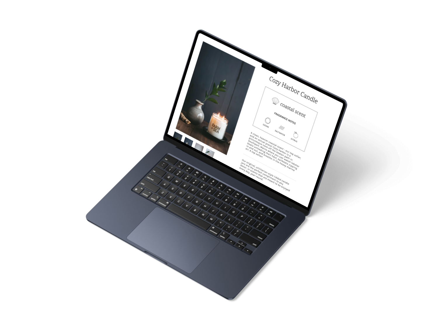
In the development of our high-fidelity wireframes, we prioritized enhancements aimed at improving overall readability and user engagement. One notable adjustment was the increase in text size, which significantly boosted legibility and user comfort across various devices.
We also focused on creating a digital experience that feels cohesive with the brick and mortar store. This manifested through the ui design where we incorporated custom, hand-drawn vector icons. This ui design enriches the user experience and strengthens the connection between the digital interface and the brand’s ambiance, creating a more immersive and aligned brand experience.
Desktop Designs
Mobile Designs
5.
Test
Usability Testing
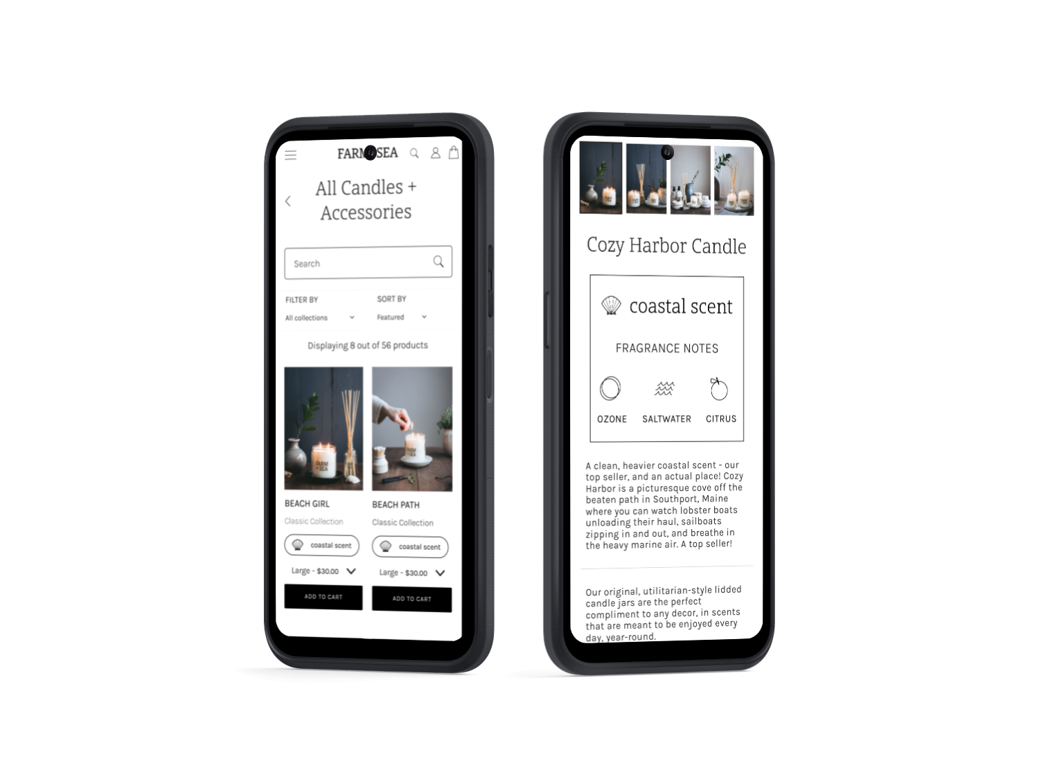
Users were provided with the early prototype and asked to imagine that they are interested in exploring the Farm + Sea website, and eager to learn more about the Cozy Harbor candle.
“You want to learn more about the Cozy Harbor candle, and decide to add this to cart. How would you find more information about the candle and subsequently add it to your cart?”
Evaluate the ease of locating a specific product, adding the item to cart, and navigating to check out. [For the sake of this test, users will be prompted to locate a Cozy Harbor Candle]
Track the users’ navigation through the site and identify the primary methods used to add item to cart
Add-to-cart button on card components, utilizing the search feature, and engagement with the product display page
Gather data on the usability of the product and overall user experience.
Test Goals
The Results
100% of users were successful in reaching the goal screen (viewing their cart with an item added)
Users reacted positively to the newly designed UI Kit, especially the scent tags and increased text size
Users rated the ease of the assigned task flow, adding a Cozy Harbor Candle to their cart, as an average of 4.2
Positive Feedback
Room for Growth
Despite reaching the goal screen, some users experienced up to 64% misclicks while trying to navigate the menu and select the search icon
In addition to the misclicks, users expressed a desire for a functioning search icon in the navigation bar.

Click heatmap
The red indicates multiple, inactive clicks on the search icon in the navigation header.
6.
Implement
Final Prototype
The final prototype effectively incorporates the growth opportunities identified during usability testing, which further aligned this redesign with users’ expectations and goals. Key improvements include the addition of an active search icon in the navigation bar and the introduction of optimized search screens.
Overall, these refinements not only streamline navigation and product discovery but also reinforce the brand’s identity, creating a cohesive and engaging user journey.