
Word of Mouth: end to end app
Word of Mouth is an app designed to support backpackers in planning their hiking treks.
Featured case study: gear lists
Project Details
Roles:
Product Designer
Timeline:
1.5 months
Tools:
Figma, Adobe Photoshop, Lyssna user testing

Key Features
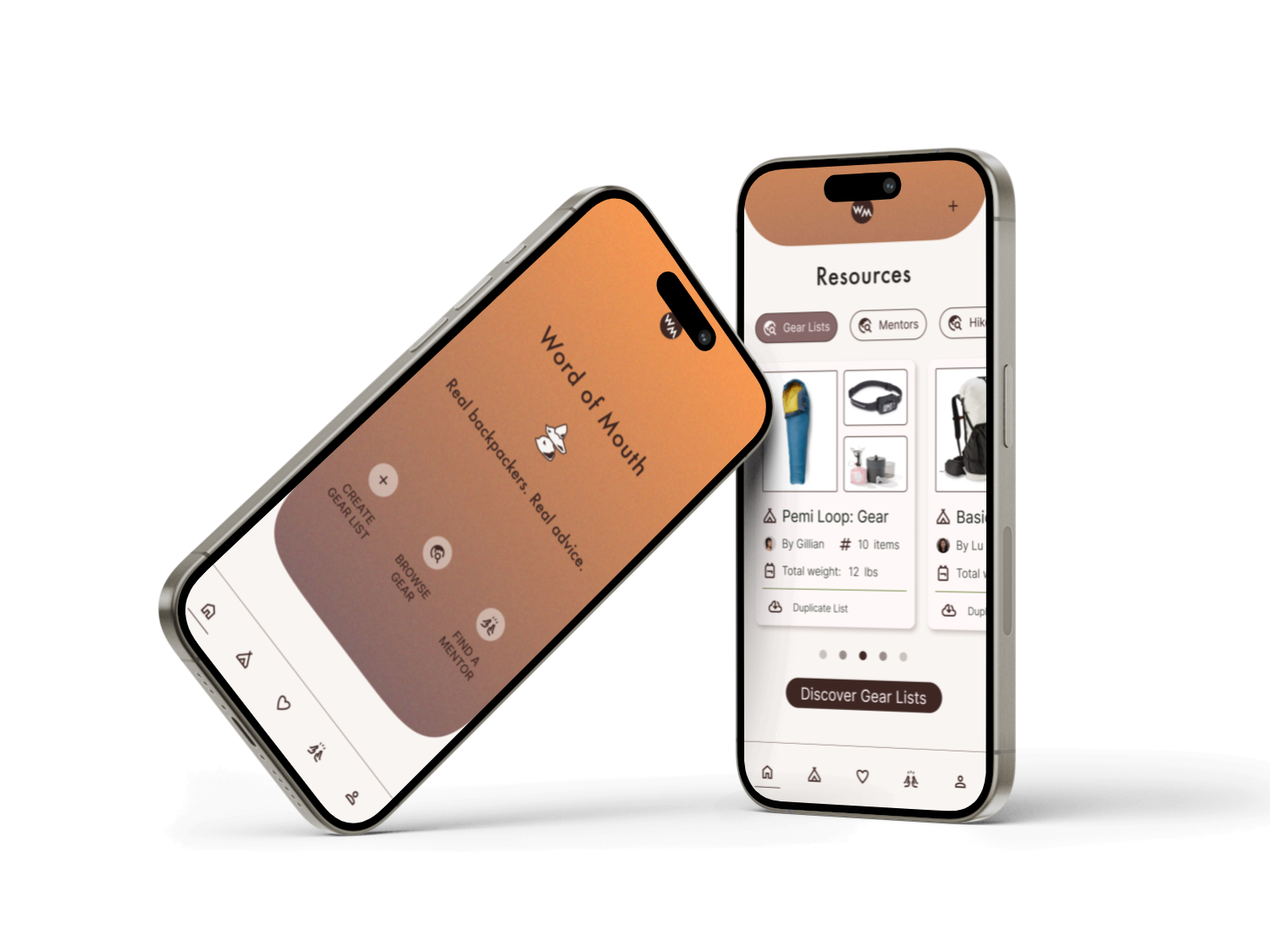
Word of Mouth is an ongoing project to create a holistic planning app for backpackers and thru hikers. Users can search and interact with resources like gear lists, mentors, and hike routes. This case study focuses on the gear list feature.
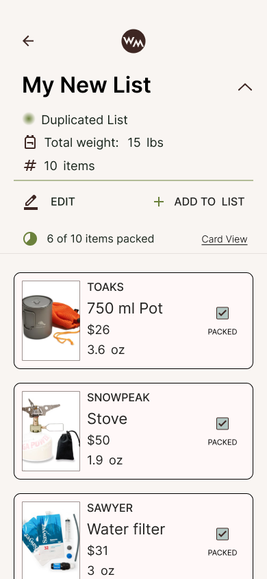
Users are able to browse, create, or duplicate community gear lists. Backpackers can seamlessly plan their packs, edit quantities with automated pack weights, and check off their pack list as they go.
Backpackers can browse or search specific gear items, read reviews, and add gear to their gear lists with ease.
1.
Empathize
Background
Initial research revealed that only approximately 33.3% of backpackers in the U.S. identify as women. Data on non-binary backpackers was not available for analysis in the surveys conducted by several organizations. We wanted to understand why gender diversity was not growing with the increasing population of backpackers, as the recreation has become popular in recent years. The first round of user research, conducted with women and non-binary participants, identified the common pain point users experience is the overwhelming nature of planning a backpacking trip, due to dispersed resources and planning tools. There is not currently an app on-market to host all aspects of planning a backpacking trip. Additionally, the interview participants felt anxious about the unknown elements of the backcountry. This sentiment was consistent across backpackers of all levels.
To identify the areas of planning that we can support novice backpackers on, the second round of user research focused on the specific aspects of a backpacking trip that need to be planned. Interview participants described their general attitude towards backpacking and planning, before diving in to share their nitty gritty methodology for planning each aspect of a multi-day hike. All participants described their association with backpacking, as a trip where you are carrying everything you need, for multiple days, on your back. These circumstances necessitate that users must be prepared for a multitude of events, while packing light.
Gather user research to identify an end-to-end flow to provide the users with digital resources necessary to plan for a backpacking trip.
Determine the next steps in building out features on the Word of Mouth.
Research Objectives
User Interviews
Round One: Understanding Backpacking Culture and Motivations
5 interviews were completed over video chat and/or in person. Each interview took approximately 40 minutes.
Participants ranged in age from 20-50 years old
2 Participants classified themselves as expert hikers, while the other 3 participants classified themselves as beginner hikers
The interviews focused on identifying the primary goals and pain points of people who backpack in nature recreationally
Round Two: Understanding Priorities and Techniques to Plan a Trek
5 participants were interviewed over video chat and/or in person. Each interview ran for approximately 35 minutes to 1 hour in length.
Every participant was an intermediate to expert level backpacker
The interviews focused on identifying the primary strategies and resources that backpackers use to plan a trip
The interview focused on identifying one priority, in planning a backpacking trip, that can be explored as a feature in the Word of Mouth app
Affinity Mapping
Users engage with resources for planning that have a grassroots origin. Backpackers value primary sources as critical aspect to any trip planning tool.
Key Insight 1
People who consider themselves beginner level backpackers, have consistent primary barrier: people experienced a sense of imposter syndrome and a fear of the unknown elements of particular hikes. Upon further questioning, it became clear that these mental barriers resulted from a lack of a holistic resource for the varied aspects of planning a backpacking trip. At present, interview participants were consulting between 5-10 resources to plan a single trip. This commonly led to the sense of imposter syndrome, and at times the abandonment of planning altogether.
Key Insight 2
Backpacker’s priorities for planning a trip were assessed, to identify the most important feature necessary and determine the most viable product. Planning and preparing gear for a trip was unanimously ranked a top priority, when interview participants ranked planning items on a linear scale.
Key Insight 3
User Persona
Red is a beginner to intermediate level hiker who is interested in expanding her skillset. She wants to plan a multi-day hike, but she does not know how to plan gear for an overnight hike. Since she will have to fit every thing she needs for 2-3 days in a backpack, she feels overwhelmed at the idea of planning gear. Red wants to source help through community based resources that amplify the voices of primary sources.
Competitor Analysis
The competitor analysis focused on the key features of other backpacking and trip planning apps: AllTrails, Far Out, VRBO, Wanderlog, and Lighter Pack. The feature audit of top competitors illustrated the voices of our interview participants: there is currently no holistic planning app for backpackers.
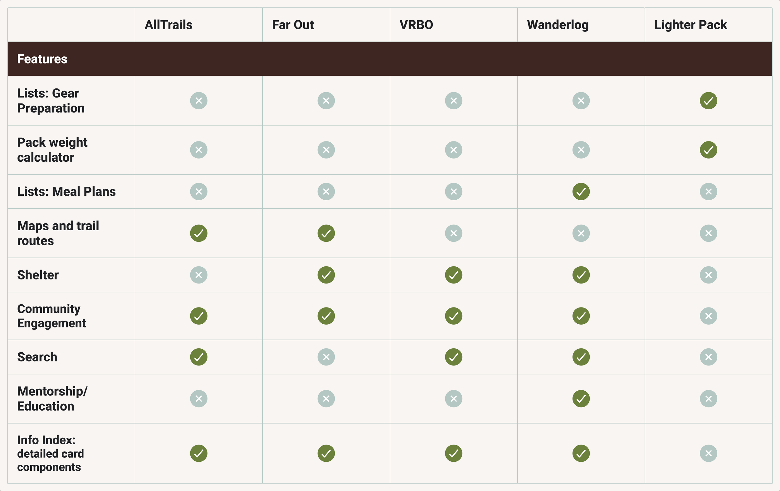
Key Features:
Search
Community Engagement
Education/Skill Share
Feature Gaps:
Limited support in gear planning
Manual, repetitive tasks to create lists
Secondary Research
During the user interviews, participants called out their use of forums and communal groups, like Reddit and Facebook, as a leading resource for planning their backpacking trips and thru hikes. We dug deeper and noticed a pattern for this preference.
Backpacking culture is synonymous with a grassroots approach. Its very structure is based on the people in the community.
Backpackers desire a narrative with their travel
Backpackers trust primary sources who have completed the hike themselves. (Hikers call this beta: insider information about a trail from someone who has already completed it)
Backpackers are venturing into the wilderness. They are traversing landscapes accessible mostly, and at times only, by foot. To truly know what to expect, you must have been to the location- or speak with someone who has.
2.
Define
Task and User Flows
The user research determined that users named gear as the most important aspect of a backpacking trip. Once your gear is dialed in, you can achieve wonders. Three flows were generate to capture the a users journey in planning for gear on the Word of Mouth app.
The Simplified Flow: highlights a user’s overarching path to duplicate a community member’s gear list, and manage it in their own personal account.
The Add a Gear List User Flow: This user flow explores all potential paths a user may take to add a gear list to their account. This user flow considers browsing, search, and direct behaviors
The Manage Gear List User Flow: This flow explored the actions a user will take to manage their gear list for use. This includes editing functions, checklist functionality, and editing content with form fields.
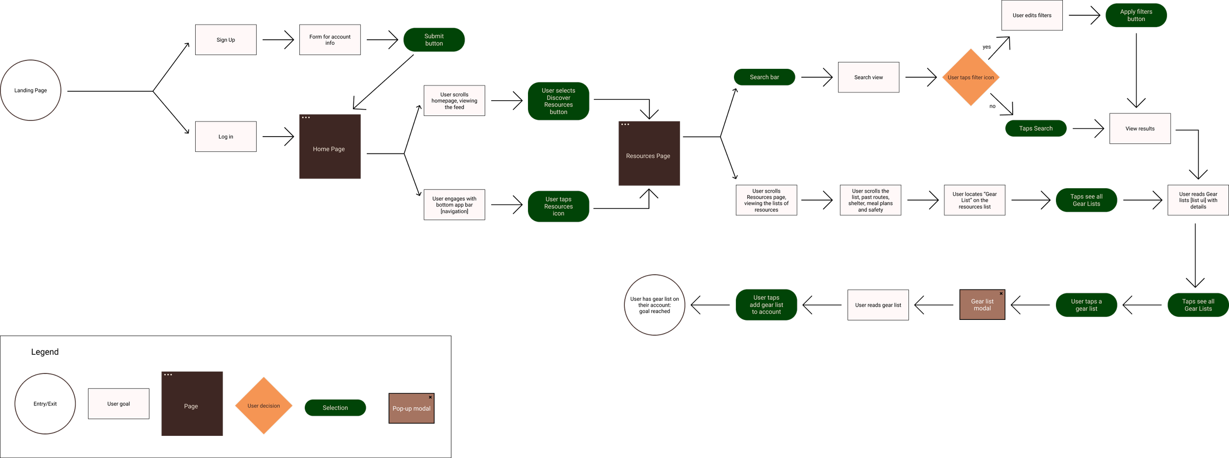
The Add a Gear List User Flow
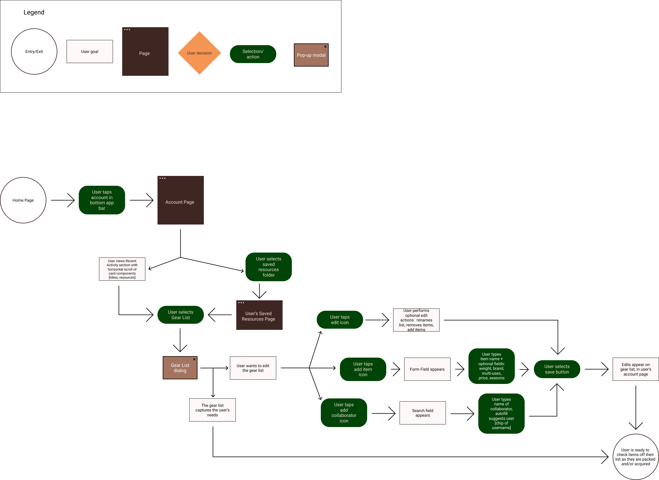
The Manage Gear List User Flow
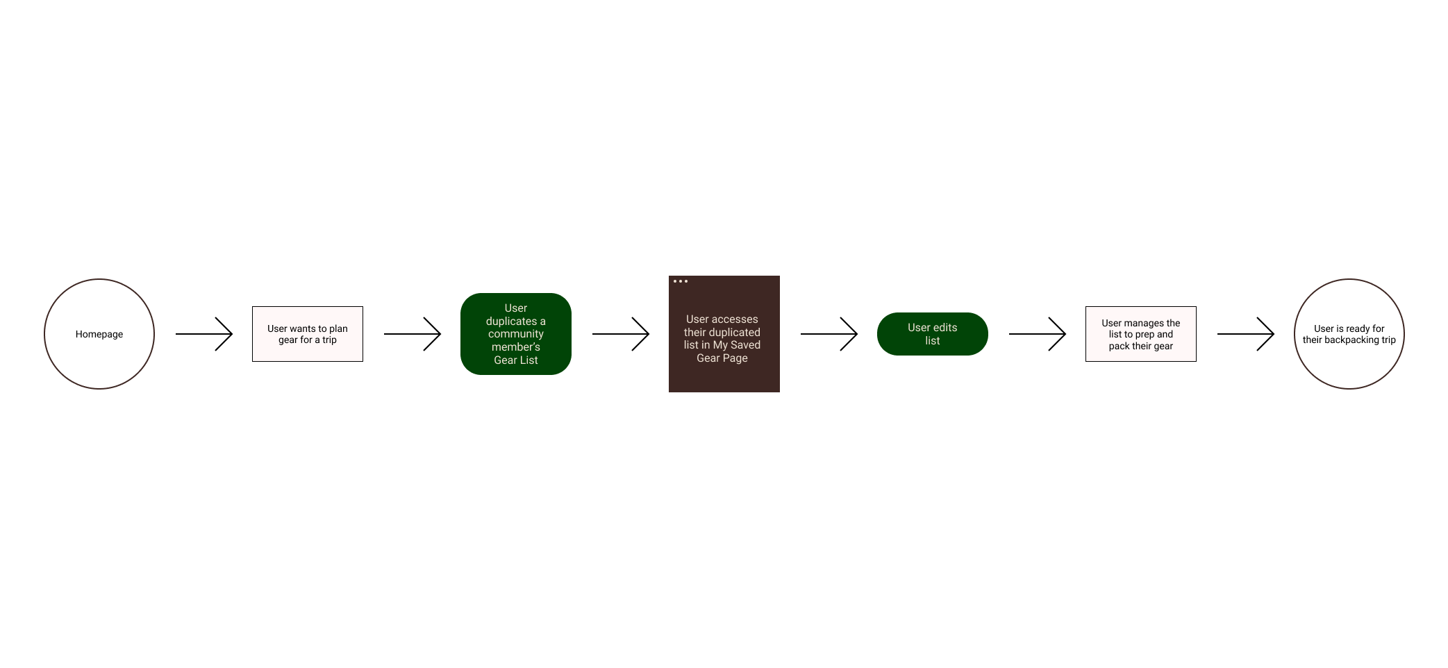
The Simplified Task Flow
3.
Ideate
Problem Statement
Backpackers can experience analysis paralysis while planning a multi-day hike. The lack of a streamlined platform for backpackers, requires users to consult resources across dispersed locations. Additionally, backpackers of any level can experience an anxiety towards the unknown as they expand their skillset and/or hike in a new region.
During a series of interviews, participants unanimously agreed that planning the gear for a backpacking trip is an essential component. The nature of backpacking requires users to be prepared for anything, while maintaining a light-weight set up. This can become increasingly overwhelming as users plan hikes in regions and/or conditions they have never experienced.
Feature Prioritization
The key features for the first iteration were determined using an Effort vs. Impact Matrix. The features in consideration were influenced by the competitive analysis, but solidified by the motivations and pain points of our users, as identified in our two rounds of user interviews.
Low Fidelity Wireframes
The low fidelity wireframes came to life over several iterations. Each version focused on simplifying the steps users need to access gear lists, while maintaining an atmosphere that users find motivating to browse. Ultimately, the iterations manifested as the screens outlined below.
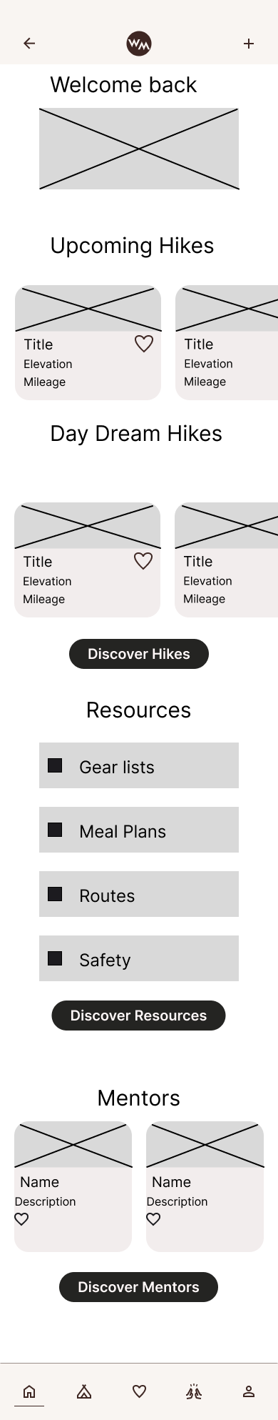
Home page

Discover Gear: Browse Tab
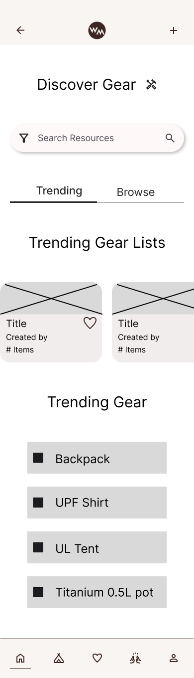
Discover Gear: Trending Tab
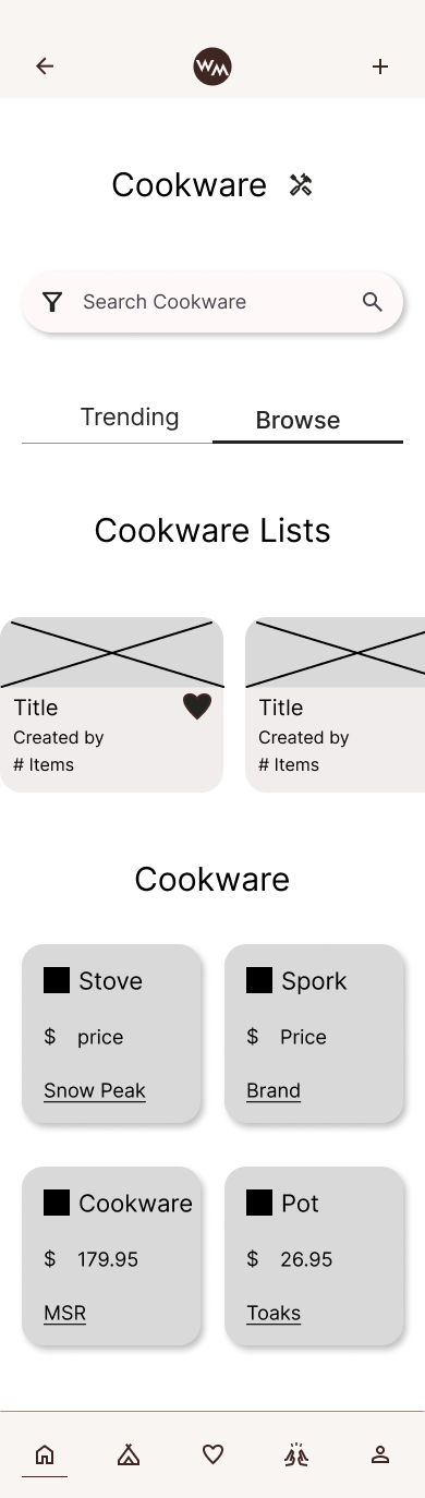
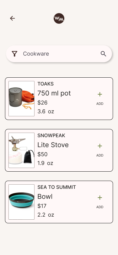
Cookware Page
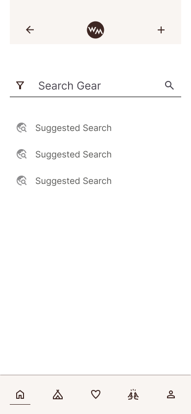
Search View
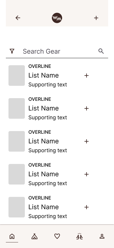
Search View: Results

Product Page
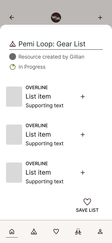
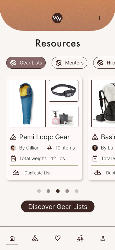
Bottom Sheet: Community List
Bottom Sheet: Edit Gear List
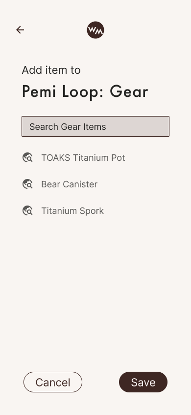
Modal: Add Item
Modal: Add Item
Branding and UI Development
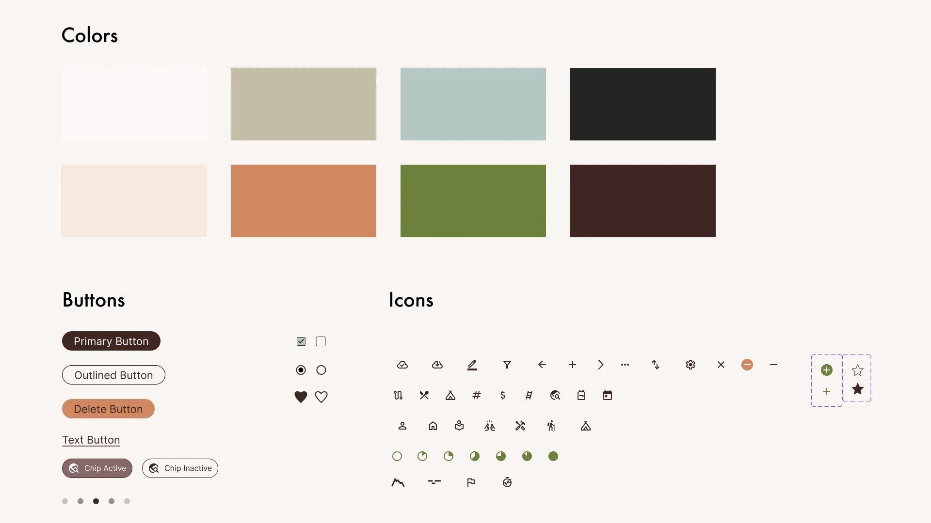
I combined the ux research and market research on backpacking trends to develop a brand identify that felt succinct with backpacking culture. Backpackers tend to associate with refined, utilitarian design that reference spaces in nature. This directly influenced the color palette and simplified ui elements.

High Fidelity Wireframes
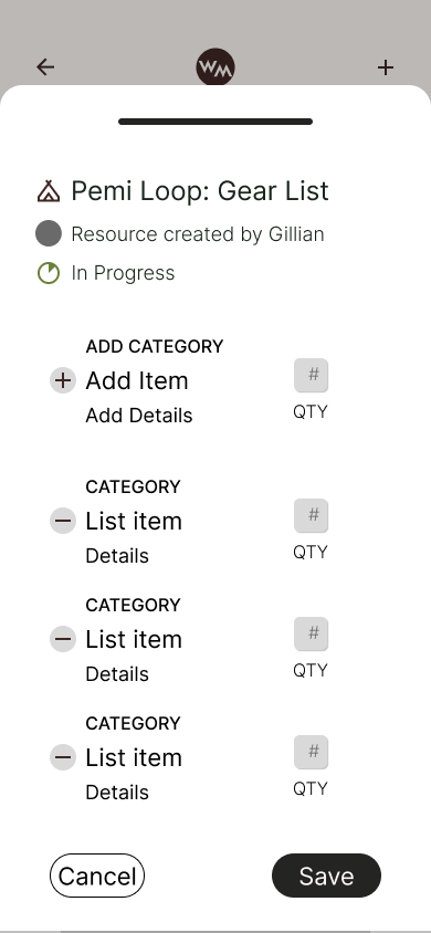
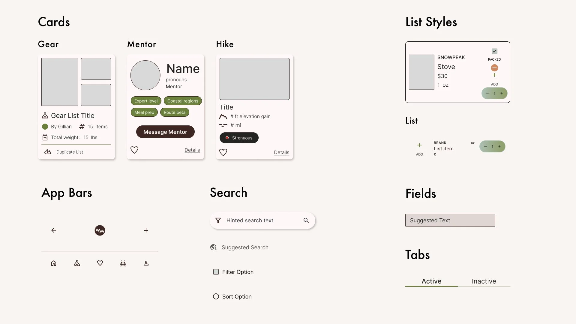
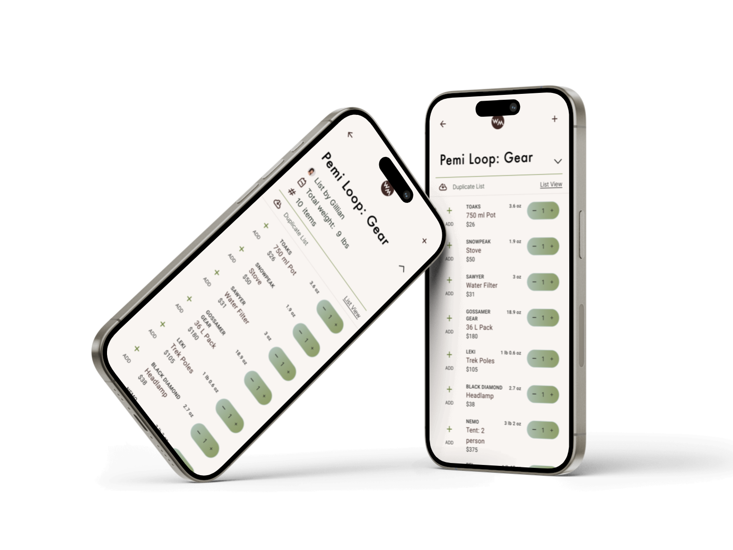
The high fidelity wireframes explore a simple, focused design to mirror backpacker culture: achieving the most with the simplest set up. We integrated the use of gear lists with weight for each item and total list weight. The ability to check off packed items, and edit gear list names and item quantities with ease. The overall design nods to analog lists, and the apps primary function: support users in planning their gear for different treks.

Loading Screen
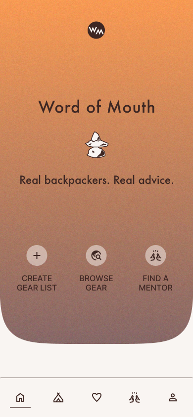
Home Page: Top
Home Page: Botttom
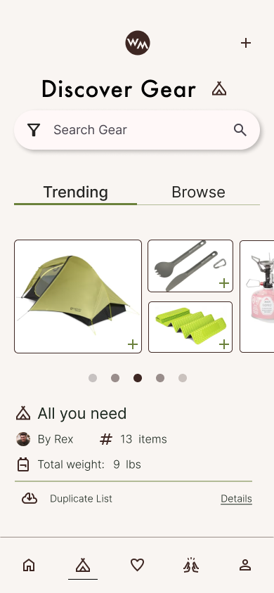
Discover Gear: Trending Tab

Discover Gear: Browse Tab

Search View
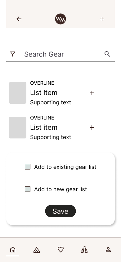
Add Item via Search
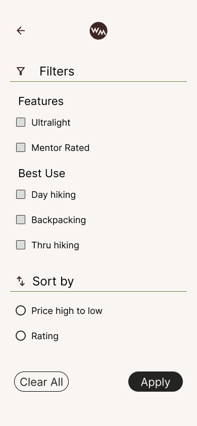
Search Filters
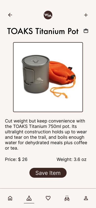
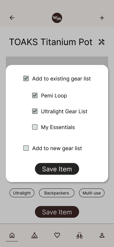
Product Page
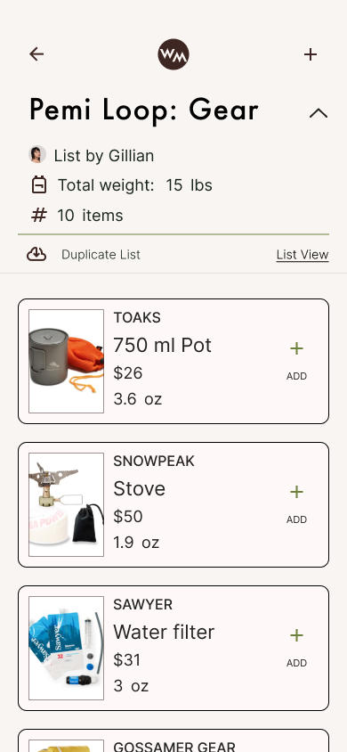
Community Gear List
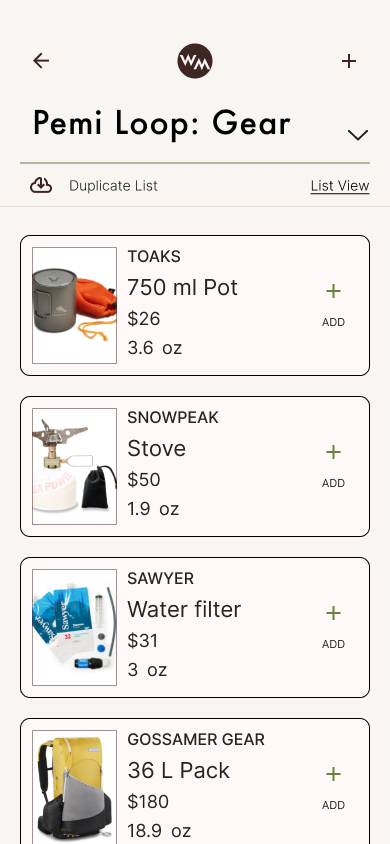
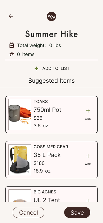
Gear List
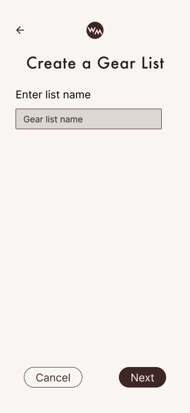
Creat Gear List
New Gear List
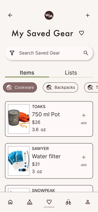
Saved Gear Items
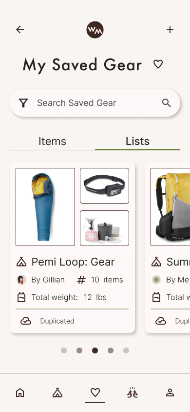
Saved Gear Lists
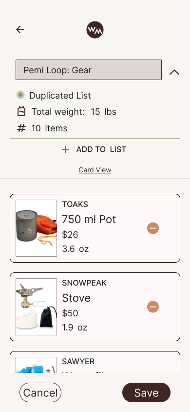
Edit Gear List
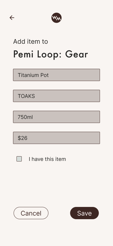
Add Item Form
Duplicate List: Renamed
Search Results: Card View
4.
Prototype
Prototype
The early prototype focused on providing users the opportunity to browse different gear items and gear lists, save items & duplicate lists, and manage lists in their account. This early prototype was used to conduct usability testing to validate the designs both in function and form.
5.
Test
Usability Testing
I created a moderated user test to assess the key tasks outlined in the user flows. The usability plan outlined both tasks for assessment and the success metrics to analyze the results.
The tasks:
The user creates their own gear list
The user duplicates a gear list to use in their account
The user manages their gear list
The success metrics:
Error rate: Quantitative record of the number of mistakes or missteps taken during each task
Predictability: Assess whether participants found the features to function in a predictable manner and intuitive to use. Assessed through a linear scale and follow up questions
User Satisfaction: Ask participants to rate their satisfaction with each feature on a linear scale. Follow up questions captured qualitative data on user satisfaction
The Results
Positive Feedback
Users rated the tasks as moderately easy to accomplish, generally between a four and five.
Users found the ability to browse delightful and accessible
Users found the information on cards (number of items, total weight, and labels) clear and helpful.
The UI and visual layout received positive reactions
The ability to navigate between pages can be improved to increase flexibility and support the users’ flow through pages and tasks.
Create clearer labels and paths, specifically to the My Gear page where users’ lists are housed.
Provide more room for customization in list views and better support in managing lists
Opportunities for Growth
6.
Implement
Prototype V.2
The prototype incorporated the growth opportunities identified during usability testing, significantly enhancing the user experience. Most notably, the navigation was refined to balance focused flows with an ability to exit the flow with ease. Additionally, the list ux and ui was modified based on user’s feedback.
The gear lists were updated to include a collapsable header. This enables users to switch between two tasks: review important list details (total items and weight) and viewing all items at once. Additionally, quantity chips were added to each list item in the common list mode. The first prototype enabled quantity adjustments in edit mode only.
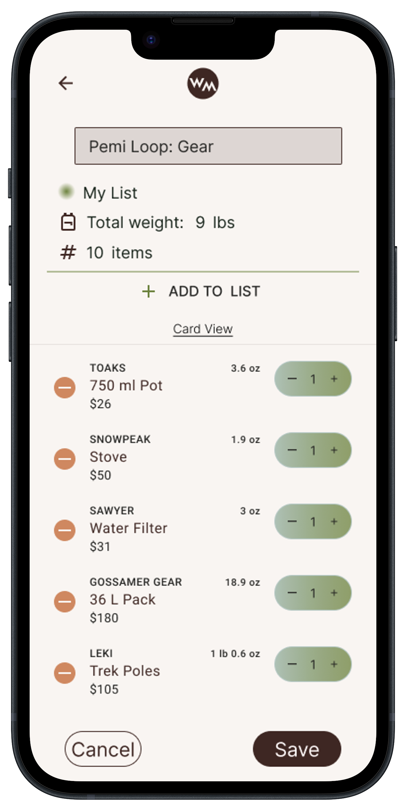
The edit mode of a user’s gear list implemented cleaner ui and the ability to rename a list. In the first prototype iteration, users could not edit a list names. Several users expressed a strong desire to edit list names, especially lists that they had duplicated to their account from the Discover pages.

The Discover Gear page header was collapsed into the search bar. This parallels modern design systems and increased the scrollable area.
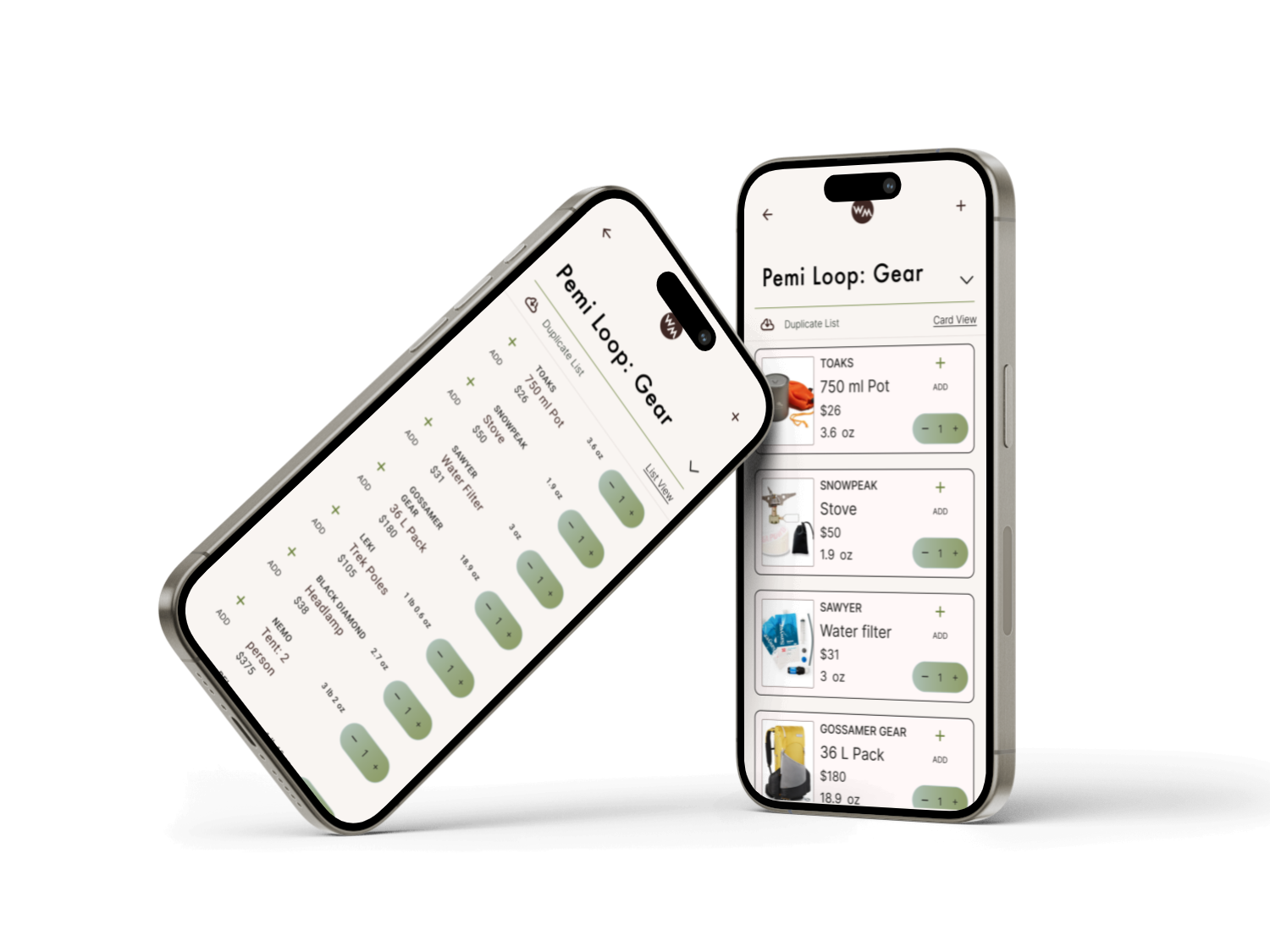
The gear lists now feature a customizable viewing experience. Users can seamlessly switch between Card View and List View based on their preferences and needs.
*
Onwards
On the horizon
This case study is just one glimpse into an ongoing, personal project. The next steps are to continue testing and refining the features and ui changes outlined above.
The next feature build out will be Mentor resource section. This area will connect users to experienced backpackers, taking on a Mentorship role. These mentors can share their gears lists, beta for hikes, and eventually even meal plans.
Stay tuned!